History of computer design: Apple Lisa
4-frogdesign || 5-Corporate focus || Conclusion || Bibliography & links
![]()
![]()
 The physical
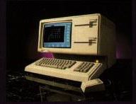
design of the Lisa departs from the style Jerry Manock
developed in the Apple II. Instead, its principle designer,
Bill Dresselhaus, followed a concept long held by Steve
Jobs. Its circuitry, display and two disk drives are
contained in a single unit with a keyboard connected by a
cord at the front. The screen with the disk drives to its
right is cantilevered with a space below into which the
keyboard can be pushed, giving the unit an appearance
vaguely suggestive of an animal on its hind legs. The
familiar chamfered corners appear at the sides and top of
both the Lisa and its keyboard, but they have curves at
their bottoms which, on the Lisa, suggests a chin. The mouse
plugged into the back is the only obvious sign of its
graphical operating system, but the Lisa has a cheerful,
life-like appearance that reflects the new technology.
The high price of the Lisa was partly a result of the large number of people involved in the project (Morgan, "Interview", 99). Just as with the Apple III, a growing number of features crept into the design. In particular, a megabyte of RAM, then unprecedented in a microcomputer, elevated its price. The Lisa also used specifically designed disk drives which were expensive to build, less reliable than the current 5.25" disks, and were replaced in the later, upgraded Lisa 2 by the 3.5" drive that was first implemented on the first Macintosh computer but designed at Sony rather than specifically by Apple. This Lisa 2 was introduced along with the Macintosh, and then altered to become the Macintosh XL in January 1985 (see technical specifications), but it was sold only for a few months.
The increasingly obvious
commercial failure of the Lisa created an anxiety at Apple
similar to that before the release of the IBM PC. In fact,
there were rumours that IBM was to release a less expensive
improvement to its popular PC in 1983, so Apple's
position seemed precarious
(Sculley, 147-9).
The Apple II computer  had received some minor improvements
in 1978, earning it the name Apple II+, and an "enhanced"
Apple IIe was released along with the Lisa in January 1983.
The IIe had several internal improvements as well as ports
on the back for new peripheral standards and a keyboard that
could produce lower-case as well as upper case letters. It
would be a very successful computer, sold until 1993, but it
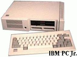
was decidedly not revolutionary technology. IBM's
much-anticipated follow-up to the PC, the PC/Jr. (often
known as "Peanut") turned out not to be a significant
improvement when it appeared in October 1983, but, with the
Lisa emerging as too feature-ridden to sell and the Apple II
offering little new, it increasingly seemed that Apple's
future relied on a small project called Macintosh
(Chposky, 158-61).
Home || Introduction || Historiography || 1-Cottage industry || 2-Emerging standards || 3-Macintosh
4-frogdesign || 5-Corporate focus || Conclusion || Bibliography & links


.jpg)


