History of computer design: IBM PC
4-frogdesign || 5-Corporate focus || Conclusion || Bibliography & links
![]()
![]()
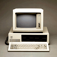
 The PC has its circuitry and disk drive
within one enclosure, while having a separate keyboard and
monitor. Though the Apple III also separates these
components, they remain visually somewhat united by being
the same width. The IBM components have no such cohesion,
the width of the case exaggerated through juxtaposition with
the smaller monitor and keyboard. In 1981, the PC keyboard
was regarded not simply as a peripheral, but as a
significant component of the computer. Its layout and
dimension gained much attention
(Williams, 36). This
keyboard allows greater freedom for the user with a long
cord connected, albeit quite awkwardly, to the back of the
main case. It is a rectangular slab tilted towards the user
similar to Commodore's VIC-20 and
64 computers, but thinner and longer to accommodate a
larger number of keys. The general shape is still the most
familiar appearance of computer keyboards today.
Unlike the Apple III, there is little about the case of the PC to attract or reassure its user. While the Apple III has a smooth front bezel broken up only by its disk drive and badge, the PC has a visually busy face. Its off-white plastic bezel is broken up by a row of vents below the badge on its left. An area twice the length of this vented surface is recessed into this bezel, but the white plastic strip which frames this recession on its right destroys what would otherwise be a division into a visually pleasing proportion of thirds, and produces the illusion that the case is even wider than it is. The recession, which contains a disk drive with space for a second, is emphasized by its flat black colour. The plastic bezel extends less than an inch into the length of the machine where it is abruptly joined to the sheet-metal enclosure which covers the large rectangular body of the computer. The corner from the top surface to the sides is rounded, but all others are left sharp.
The sharp corners, the abrupt division between bezel and body, the oddly proportioned and contrasting recession for the interactive area of the case, and the overall unabashed boxyness all contribute to a makeshift, utilitarian appearance. This is particularly reinforced by the placement of the vents and disk drive. Whereas the smooth front of the Apple III inclines towards the user to facilitate access to the disk drive, the IBM PC front is vertical, with its drive recessed from the user and its vents physically closer and visually more apparent. The position of the PC as a computer designed for work is actually enhanced by the small amount of attention given to aesthetics. Its industrial look differentiates it from contemporary consumer computers in a way exactly opposed to how the Apple II was differentiated from the crude design of hobbyist kits.
To the Macintosh
Revolution (1983-85) ![]()
Home || Introduction || Historiography || 1-Cottage industry || 2-Emerging standards || 3-Macintosh
4-frogdesign || 5-Corporate focus || Conclusion || Bibliography & links


.jpg)


