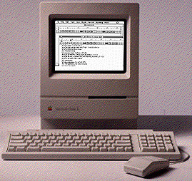
History of computer design: Macintosh Classic
4-frogdesign || 5-Corporate focus || Conclusion || Bibliography & links
![]()
![]()
 The third
new product to be introduced at the end of 1990 is the
Macintosh Classic. The Classic is the final adaptation of
Manock and Oyama's industrial design, and it returns some of
the appearance of the original while retaining much from the
simple Snow White details of the SE. The Classic case
retains the rounded corners and zero-draft case of the SE,
along with the treatment of the floppy drive within a strip
across the front bezel. However, the Snow White lines of the
SE are not found on the front of the Classic, and the
vertical lines around its base are replaced by vents through
four horizontal Snow White lines. This simple, unadorned
appearance seems true both to the original design and to the
"pure" Snow White expressed by the Apple IIc.
The circuitry of the Classic is also simpler and closer to the elegant appliance computer envisioned by Steve Jobs. The circuit board was completely redesigned to keep the retail price at $999 - the price originally intended by Jef Raskin (Kunkel, 75). To reduce costs, it has no expansion slot, though it does, of course, have a hard drive with its requisite fan (see its technical specifications). The curve of the front bezel is increased to the same 50-inch radial curve on the front of the LC and the IIsi, thus integrating this familiar yet singular Classic design with the other new products. This curved front bezel would become a signature detail of many of Apple's following products.
The Classic design was used once more in October 1991 for an upgraded version to replace the SE/30, called the Classic II. The first Classic was discontinued at the end of that year. The Classic design was the one chosen for display by New York's Museum of Modern Art to represent the Macintosh revolution and its physical form. When the Classic II stopped being produced in September 1993, both Apple's designers and its users felt a strong sense of loss for the most recognized and genuinely adored icon of the personal computing industry; despite Apple's years focusing on a corporate audience and its own corresponding changes in physical design, the general shape of the original Macintosh continues to represent the democratization of technology.
To a renewed consumer
focus (1990-91) & Conclusion
![]()
Home || Introduction || Historiography || 1-Cottage industry || 2-Emerging standards || 3-Macintosh
4-frogdesign || 5-Corporate focus || Conclusion || Bibliography & links


.jpg)


